Honey be fitwear
The Challange
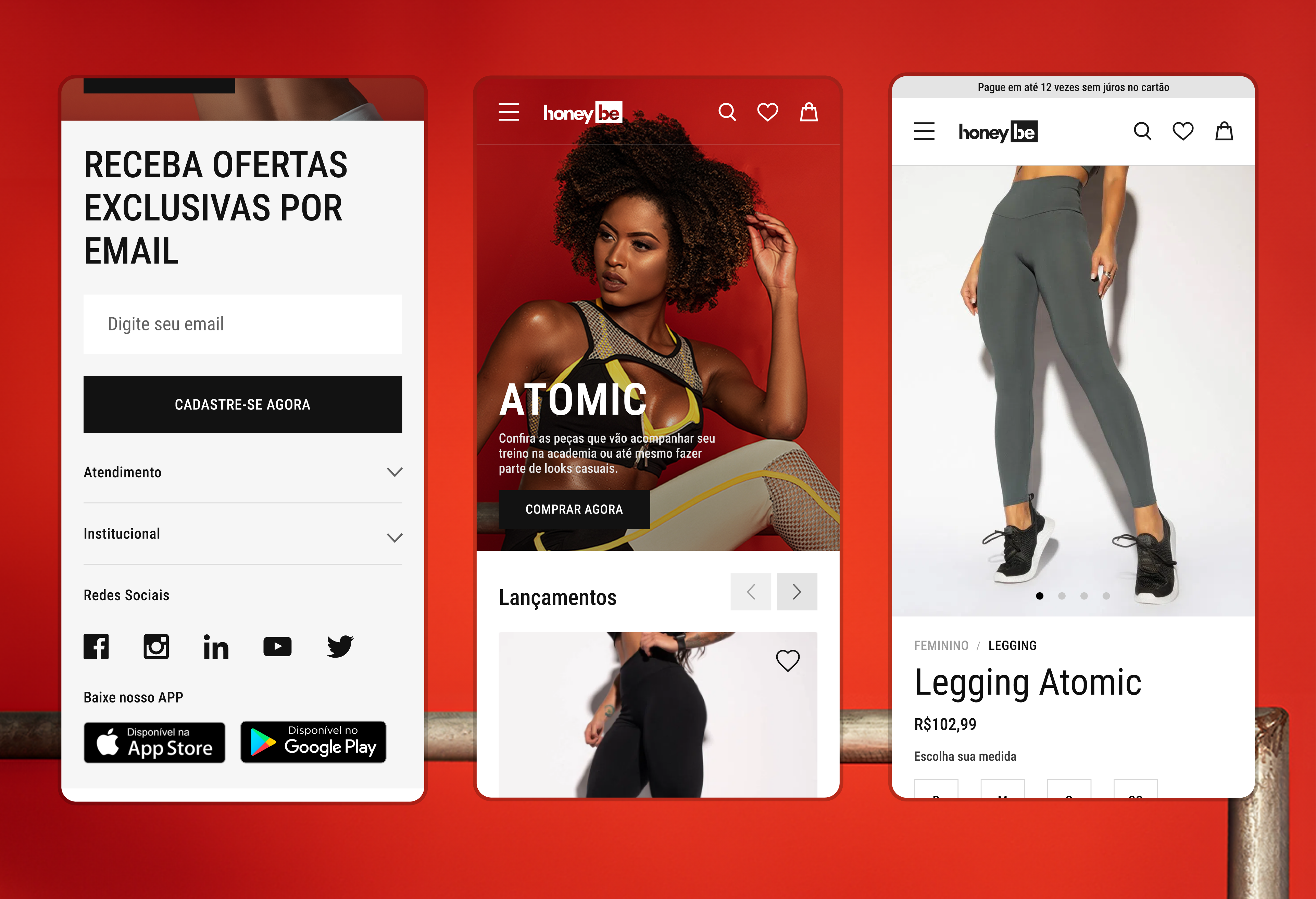
The site didn't reflect the quality of the products. It was slow, hard to use on phones, and visually outdated. Mobile users often left without completing purchases. The challenge was to rethink the experience for smaller screens without shrinking the desktop version—making navigation easier and ensuring the brand message came through clearly.
My role
As the sole designer, I led the entire design process: research, UI, visual identity, and email design. I worked with a small internal team and an external developer. I analyzed competitors, reviewed analytics, and spoke with customer support to understand user pain points. One clear issue was high cart abandonment on mobile. Since 60% of users were visiting from mobile devices, I prioritized redesigning that experience first, focusing on navigation, readbility.
1. Context
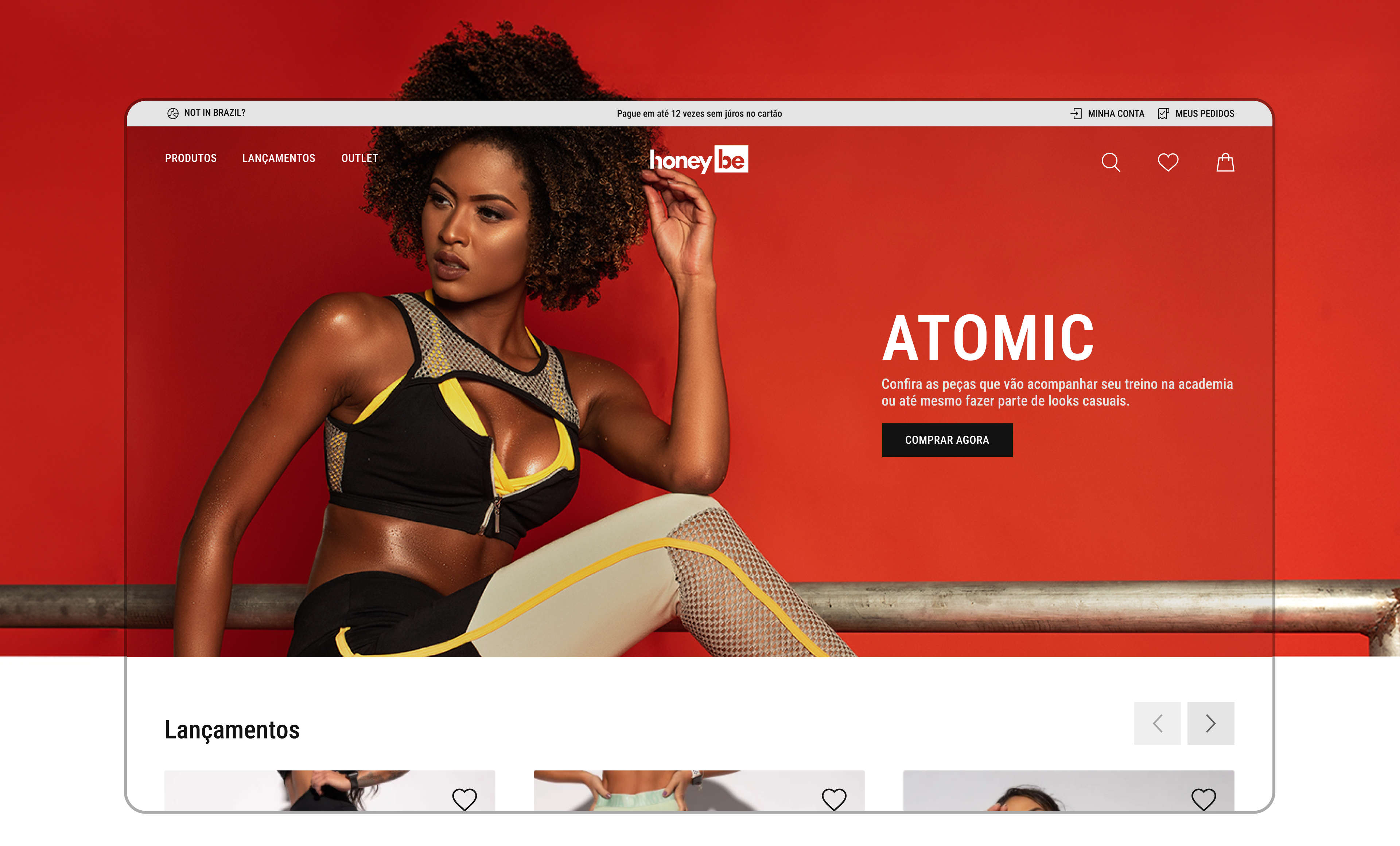
Honey Bee, Brazil's largest fitness apparel e-commerce, required a redesign to better represent its true value and market leadership. The project focused on enhancing the user experience and aligning the platform's design with the brand's commitment to quality, style, and the fitness lifestyle.
2. Challenge
The challenge was to redesign Honey Bee's leading e-commerce platform without disrupting sales. It required balancing innovation with practicality, introducing modern elements while preserving successful features to enhance the user experience and retain customer loyalty.
3. My Role
I worked as a Product and Visual Designer on this project, collaborating closely with a developer and a product manager.
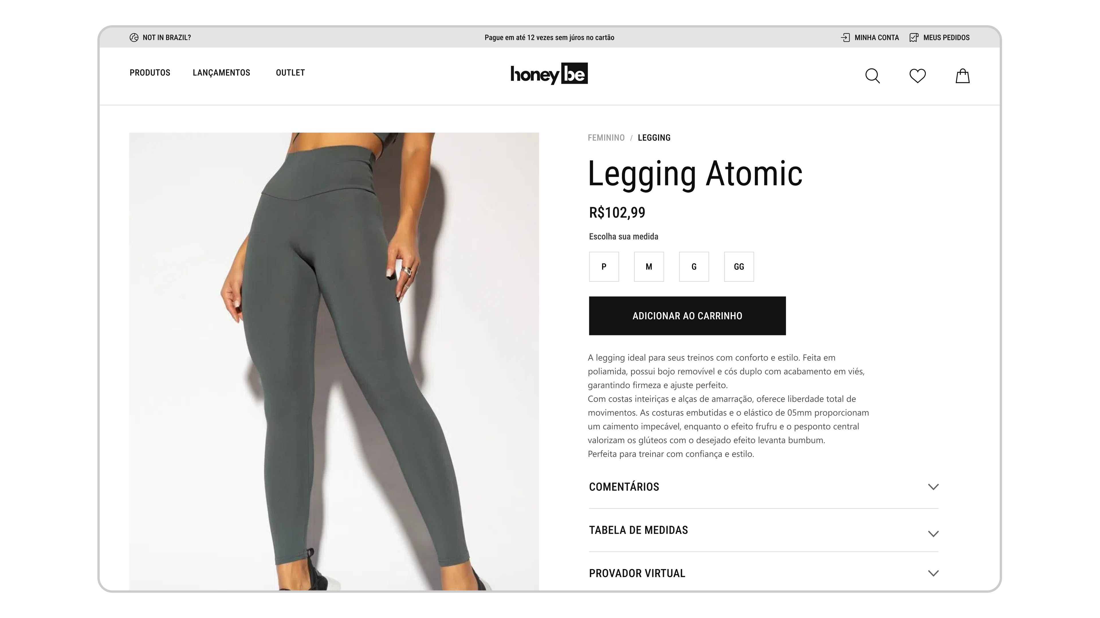
Product Page
I reorganized the product page to highlight what mattered most: image, price, size, and the "Add to Cart" button—placed at the top for quick access. The description stayed visible but secondary details like reviews and size chart were hidden in collapsible sections. Images were large and clear. On mobile, the layout stacked cleanly and was easy to tap. The goal was to make browsing and buying fast and straightforward.
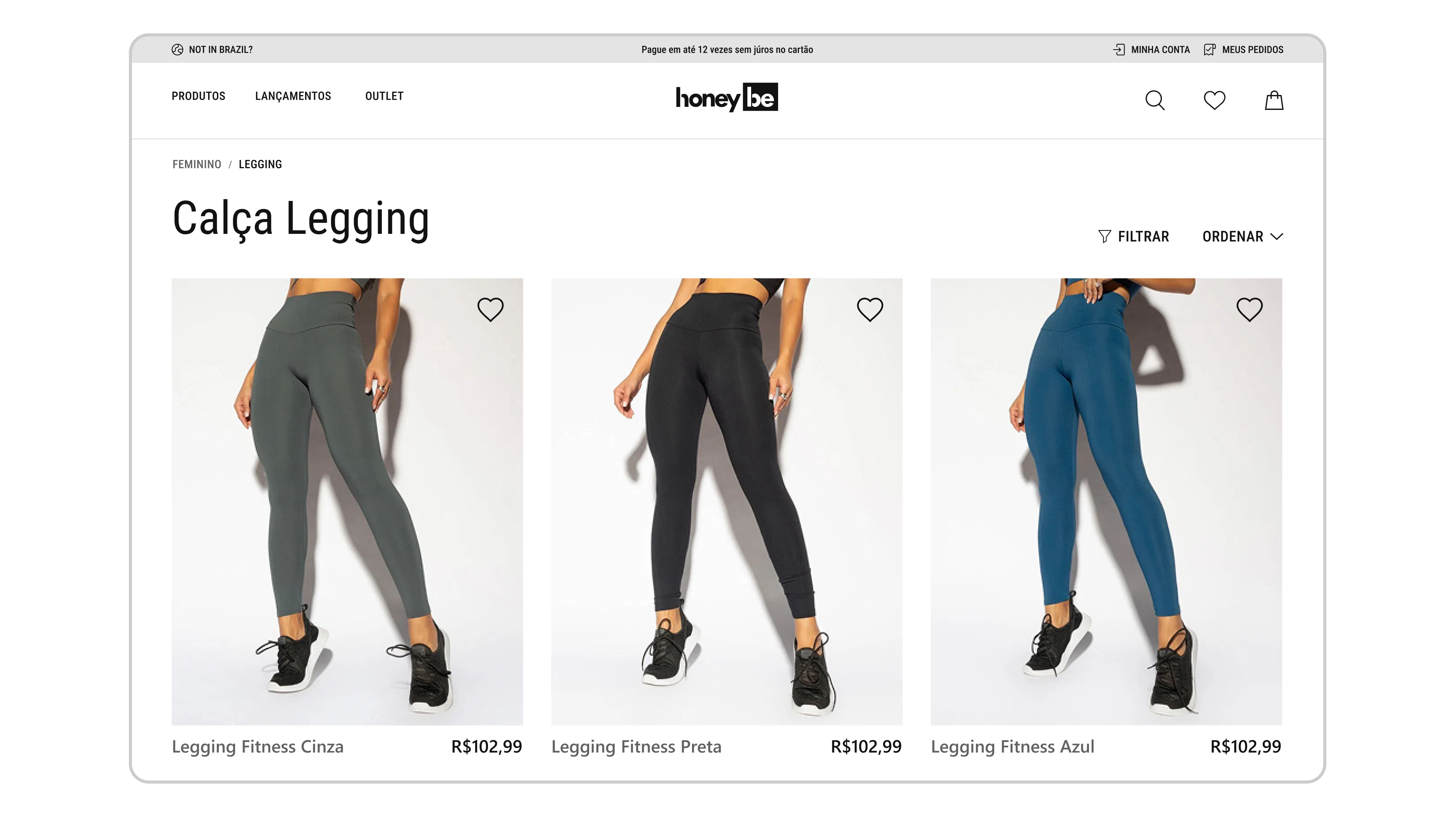
Product Categories
I simplified the category layout to help users scan and compare products faster. Each item showed a large image, name, and price, nothing extra to distract. On mobile, cards stacked cleanly with big tap targets, making it easy to scroll and browse. I removed clutter and kept filters tucked away behind a button so users could focus on the products. The goal was to make it easy to find something that looked good at a glance and get to the product page with as few steps as possible.
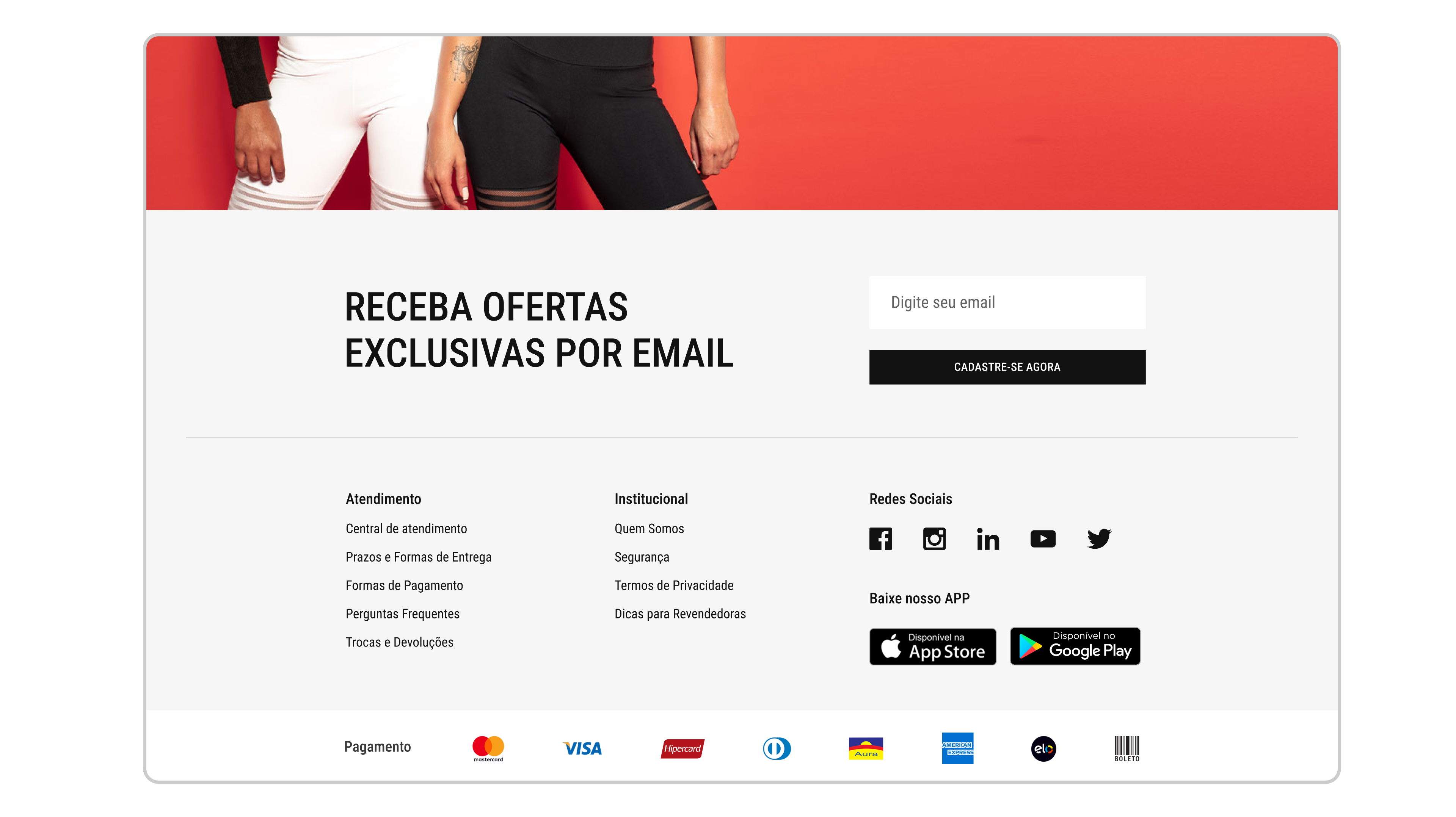
Email Marketing
I worked alongside the marketing team to understand how email campaigns drove traffic and sales. Email was a key channel, responsible for a large share of purchases. By studying which emails performed best and when users clicked through to buy, I started to see patterns in user behavior. This helped shape some of the design decisions on the site, especially around how and when to highlight promotions, product availability, and urgency.
Outcome
After launch, sales rose by 30%, especially from mobile users. Customers shared positive feedback, and the new design helped position Honey Be as a confident, reliable brand.
What I learned
Collaborating with an external dev team showed me how critical early alignment is. Miscommunication led to delays that better documentation and upfront meetings could have prevented.I also learned to approach mobile design independently, not as an afterthought, and saw how strong visuals can reinforce a brand's identity more than words alone.